Warm Undertone Color Palette Ideas for Clothes and Makeup Together
If you already have a warm or warm-leaning undertone result, this guide gathers warm undertone color palette ideas for clothes and makeup together: flexible neutral bases, accents that go beyond earth tones, and makeup families you can match to an outfit by temperature rather than by exact color. Every suggestion here is a starting point to compare against your own result, your skin depth, and the looks you actually enjoy — not a rulebook.
Two things this page deliberately does not do. It does not rebuild your whole wardrobe palette, and it does not pick one lipstick shade in isolation; both are separate topics with their own dedicated guides. Here, the job is cross-category coordination: putting clothes and makeup in the same warm-leaning conversation, outfit by outfit.
What a Warm Undertone Result Can—and Cannot—Tell You
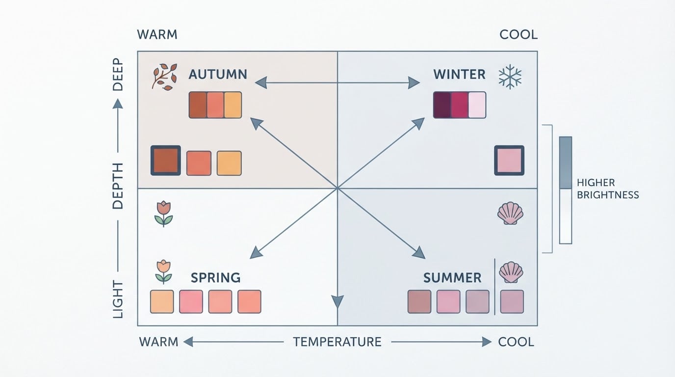
A warm undertone result tells you the temperature direction that tends to look harmonious against your skin: colors with a golden, peachy, or yellow base rather than a blue or gray one. That single fact is genuinely useful — it gives you a filter for shopping and a vocabulary for why some colors feel "right" and others feel disconnected.
What it cannot tell you is everything else that decides whether a color works: depth (how light or dark a shade is), chroma (how clear or muted it is), and how much contrast you prefer. Two people with the same warm undertone can look completely different in the same garment because their depth and contrast needs differ. Treat the result as one dimension of a working description, not a verdict that overrides your own observations — the most useful color notes record what actually wins in front of a mirror, in the colors you keep reaching for.
Start With the Colors and Products You Already Enjoy Wearing
Before adding anything new, take inventory of what already works. Look for the pattern in pieces you repurchase, colors that consistently draw compliments, and makeup you use up to the last drop. Those favorites are data: they are usually warm-leaning shades that already sit well near your face, even if you never labeled them that way.
Write them down in plain words — "cream sweater," "coral lip balm," "olive jacket" — and use that list as the anchor for every combination below. When a suggestion feels off, you can always swap in one of your proven favorites and test whether the structure still holds. Starting from your own evidence keeps the process personal instead of prescriptive.
Build a Flexible Clothing Base With Warm-Leaning Neutrals
Neutrals are the backbone of an outfit, and every neutral has a temperature. Warm-leaning versions of the usual suspects include cream and warm ivory (near-face alternatives to stark white), warm beige and camel, oatmeal, taupe with a warm cast, olive and olive-gray, and chocolate or cocoa instead of a harsh black. Some color systems describe a neutral-warm wardrobe this way: cream, taupe, olive-gray, and chocolate as foundations, with softer versions of each available at every depth.
A useful distinction: a neutral undertone (your skin) and neutral clothing (white, beige, navy, black) are not the same thing — a neutral-colored garment can still be the wrong temperature for you. So test the version, not just the color name: compare warm ivory with optic white near your face, or camel with a gray-toned beige, and note which one keeps your skin looking even. The complete neutral-skin-tone color guide explains this version-by-version testing in detail.
If black is a staple you are not ready to give up, keep it away from the face — as trousers, a bag, or shoes — and let a warm neutral carry the neckline. Placement does real work: temperature matters most in the collar, neckline, and anything framing the face.
Choose Clothing Accents Without Limiting Yourself to Earth Tones
A warm undertone is often shorthand for "browns and oranges," but the warm side of the color wheel is far wider than earth tones. Warm versions of many hues exist: coral, brick, and terracotta rose; warm teal (a teal that leans olive rather than icy blue); cognac and amber; warm emerald; burgundy, wine, and warm plum with a red base rather than a blue one; soft mustard and golden yellow. These give you color without confining you to one family.
The useful pattern is that warm-leaning accents share a golden or peachy undertone — so a rich teal or plum can sit beside a camel coat or cream top and read as harmonious, while the same hues in their cool versions would read differently. When a color is almost right but not quite, adjust one property at a time: if orange feels too loud, try terracotta rose; if a green feels cold, try a warmer olive version; if a color is too strong near your face, move it down the outfit. Accent color is a family you can walk around in, not a single approved shade.
Coordinate Makeup Temperature With an Outfit Instead of Matching Colors Exactly
Matching your lipstick to your top sounds logical but often lands too costumed. A more flexible method is temperature coordination: keep the makeup and the outfit in the same warm-leaning family without repeating an exact color. If your outfit is warm-leaning, your makeup can be, too — think peach or coral blush, bronze or copper eyeshadow, golden highlighter, and warm browns on the eyes — without any single product needing to match the garment.
Makeup guides that teach outfit coordination recommend exactly this kind of pairing: warm blush and bronze tones with warm-leaning outfits, tested in natural light before you commit. The same logic runs in reverse for balance: a very colorful or patterned outfit is often best served by calmer makeup — a warm nude lip, a soft taupe eye, muted blush — so the two layers support rather than compete. And when you want a focal point, choose one: either the eyes or the lips get the stronger color, not both.
Temperature coordination also solves the neutrals problem. A warm-leaning nude lip and peach-toned base will sit harmoniously with cream, camel, and olive in a way that a gray-pink nude might not — the undertone link does the work that exact matching would otherwise try to do.
Combination Ideas for Understated, Colorful, and High-Contrast Looks
Here are three workable structures, each shown at a different level of contrast. Use them as templates: swap in your own favorite pieces at your own color depth.
Understated (low contrast). Cream or warm ivory top, olive or taupe trousers, camel accessories. Makeup stays sheer: peach blush, a wash of warm brown or bronze on the lids, and a warm nude or tinted balm on the lips. This is the everyday formula — a warm top with a neutral bottom is one of the most reliable warm-undertone combinations, and it works for casual days and most offices.
Colorful (medium contrast). Let one warm-leaning accent lead: a warm teal blouse, a cognac knit, or a burgundy top, paired with a chocolate or olive bottom in a deeper value. Makeup can step up one level with the accent: bronze or copper eyeshadow plus a coral or brick lip, keeping everything else soft. This structure suits creative workplaces, dinners, and weekend plans where you want visible color without full drama.
High contrast / occasion-ready. For evenings, events, or anything where you want presence, anchor with a deep warm color — burgundy, wine, warm plum, or deep cognac — and add a lighter warm neutral such as ivory at the collar, in a jacket, or as the top layer. Let makeup follow the occasion's focal point: a stronger warm lip with a quiet eye, or a bronze eye with a neutral lip, rather than both at full strength. A deep warm teal or emerald worn near the face can be equally striking and shows that "dressy" does not have to mean earth tones.
How to Adapt Combinations for Different Skin Depths and Personal Preferences
Undertone is independent of skin depth: very light, medium, and deep complexions can all be warm. What changes with depth is which version of a color supports you. On deeper skin, rich, saturated versions — deep burgundy, chocolate, warm jewel tones — often hold their own, while the same hues in pale tints can read washed out. On lighter skin, softer depths of the same warm families usually keep the face from disappearing. The rule of thumb is value first: find the depth that keeps your features present, then fine-tune temperature.
Personal preference matters just as much. If your style is minimal, the understated template plus one warm neutral is a complete system. If you love pattern or color, the colorful template gives you room to play while the temperature link keeps it coherent. If you prefer high contrast, deepen the neutral side of the outfit rather than brightening everything. The outfits guide for warm undertones walks through these temperature-versus-depth trade-offs with more examples.
Record what you learn. After each outfit, note the combination, the light you checked it in, and one sentence on how it felt — "cream + olive, bright daylight, yes." Over a few weeks, your own notes become a more reliable palette than any article, including this one.
A Repeatable Clothes-and-Makeup Planning Checklist
Use this checklist whenever you build an outfit from scratch. You are done when you have a combination you can describe in one line and have checked it in natural-looking light.
- Pick a warm-leaning neutral as your base (cream, camel, olive, taupe, chocolate, or warm navy).
- Choose the day's contrast level: understated, colorful, or high-contrast.
- Add one accent from a warm-leaning family — including non-earth options like warm teal, cognac, warm emerald, or plum.
- Decide the focal point: eyes or lips, not both at full strength.
- Select makeup by temperature: peach or coral blush, warm browns or bronze, golden highlighter, warm nude lip.
- Check the whole combination in consistent natural-looking light — near a window in indirect daylight, not under a single warm lamp.
- Take a quick note (one line) on whether it worked and keep it with your color notes.
When to Retest a Combination Under Different Lighting
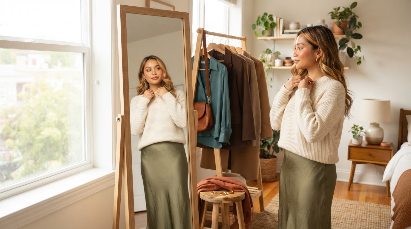
Lighting is the silent variable in every color decision. A combination that glows in the shop's warm spotlights can look flat in office fluorescent light, and makeup chosen under a bedroom lamp can read completely differently by a window. Make checking in consistent, natural-looking light part of the routine: indirect daylight near a window is the most reliable reference, and it is the condition color guides recommend for fabric and makeup testing alike.
Be equally careful with photos — camera white balance quietly shifts color temperature, so a photo can argue with what your eyes saw in person. When you retest, change one thing at a time: the light, the garment, or the makeup layer, never all three at once. Retest again when something fundamental changes — new hair color, a different season's wardrobe, or a makeup formula change — because those shifts can move a previously "settled" combination. If a combination keeps failing in one light but shining in another, the light is your answer, not your undertone.
Putting It Together
You now have a filter (temperature), a base (warm-leaning neutrals), an accent vocabulary that includes far more than earth tones, and a makeup method based on temperature rather than exact matches. If you do not yet have a confirmed result — or you want a second opinion before investing in new pieces — run the free Tone & Fit color analysis: it reads your undertone from a photo and returns your season plus five starter colors, with no account needed. You can also download the Tone & Fit app. Then treat any result as a decision aid, not a promise: the combinations that keep you coming back are the ones you test, note, and choose for yourself.
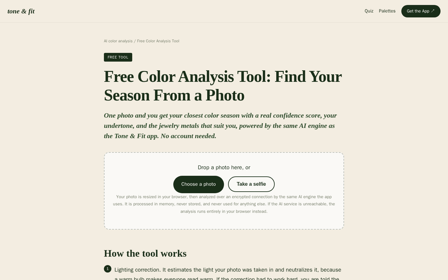
Desktop first-screen of the free web-based color analysis tool with photo upload drop zone, how-it-works steps, and privacy notes