The short answer before you book anything
A preview is a filter for direction, not a promise of the finished color. Use it to answer three questions:
- Which direction? Does the shade push warm, cool, or neutral tones toward your face?
- Which depth? Is it lighter or deeper than your natural base, and by how much?
- Which contrast? Does the shade make your eyes and skin look clearer, or flatter and grayer?
Everything more specific — the exact formula, the amount of lift, how the color will fade — belongs to a strand test and a professional's judgment, not a screen.
Start with your season, then choose a shade
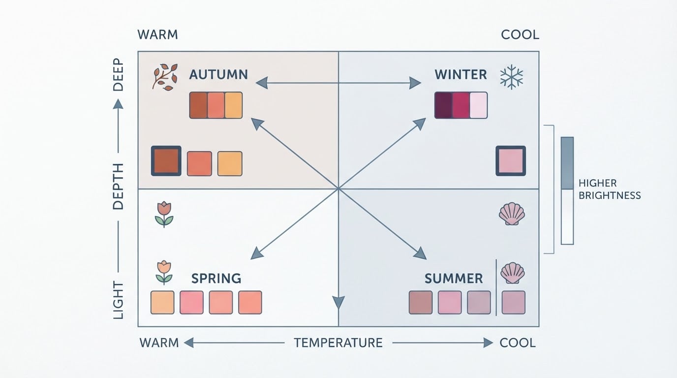
Hair color sits directly against your skin, so the first useful question is not "what color?" but "what direction can my coloring carry?" Color analysis answers that with three measurements: undertone (warm or cool), value (light or deep), and chroma (muted or bright). Together they place you in one of 12 seasons — four families, each with three sub-seasons — and each season narrows the shades that read as harmonious instead of fighting your skin.
If you want a starting point before you shortlist shades, Tone & Fit publishes this guide and builds a free browser analyzer that works from one photo. It measures your coloring, corrects for lighting, and returns a season with a confidence score, your undertone, and a handful of starter colors — no account needed, and the photo is resized in your browser and never stored. Treat that verdict as step zero.
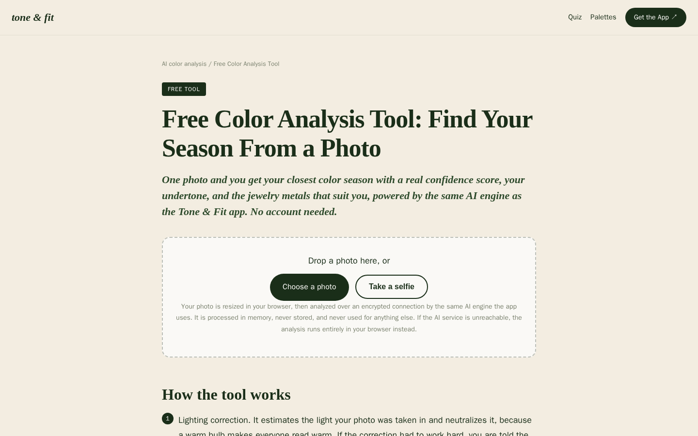
Desktop first-screen of the free web-based color analysis tool with photo upload drop zone, how-it-works steps, and privacy notes
Write down three things before you look at any shade: your season family, your sub-season if you have one, and the three characteristics — temperature, depth, and intensity. That is the brief your preview has to respect.
What a virtual preview shows you, and what it cannot
A try-on preview is genuinely useful at the level of comparison. It reliably answers direction (does a shade read warm, cool, or neutral next to your skin), direction of change (do you want to move lighter, deeper, or stay near your natural depth), and side-by-side preference (which of two candidates you actually like when you see them together).
It cannot answer four things:
- How the dye behaves on your hair. Porosity, previous color, and the developer used change the finished result, and none of that is in the preview.
- How the color grows out. Roots, fading, and the tone a few weeks later are invisible in a fresh preview.
- How accurate your screen is. Phone cameras and displays shift warmth, so a preview shot in a warm-lit room can look nothing like the same shade in daylight.
- Dimension. A flat color fill cannot show how highlights, lowlights, or a gloss would sit in real hair.
Treat every preview as a hypothesis. The appointment confirms it.
Five criteria for judging any preview
- Neutral, consistent light. Daylight near a window, no overhead warm bulb, no ring light, no evening lamp. If your skin looks warmer or cooler than it does outdoors, the shade reading is skewed too.
- A bare-face reference. Compare the preview against a recent photo of your bare face in the same light. Your jaw and hairline are the comparison zone — not your hand, which usually differs in warmth and depth.
- One variable at a time. Compare shades that differ in direction or depth, not both. If everything changes at once, you learn nothing about which change you liked.
- A realism check. Look at the hairline, roots, ends, and shine. If the color sits flat and even where real hair has depth and texture, do not trust that edge.
- An honest confidence signal. A good preview or analyzer tells you how confident the reading is and what might have thrown it off — odd lighting, a partial face, an older photo. A verdict with no confidence context is a guess.
If a preview fails any one of these, you do not have to throw it out — just downgrade what you let it decide. It can still cross a direction off your list; it cannot pick your shade.
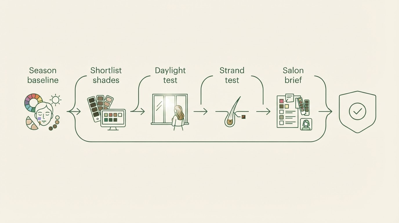
A five-step preview routine before your salon visit
- Pin down your direction. Run your season analysis first, or book a consultation if you want hands-on fabric draping. Write the direction in words: "warm and muted, medium depth" says more to a colorist than a named shade.
- Shortlist two or three shades. Keep them inside your direction and vary one thing. Two coppers at different depths is one useful comparison; a copper and an ash blonde is two decisions.
- Run the daylight test. Hold a physical swatch, foil, or extension at your hairline and jaw in neutral window light. If you are testing on screen, compare it against a same-light photo of your bare face.
- Book or do a strand test. This is the honesty check no preview can replace: how the formula actually reads on your hair, on your base, with your history.
- Arrive with a one-page brief. Your direction words, one or two reference images, your depth preference, and what you want the color to look like in a month. A stylist can build a formula from a direction and a depth even when the named shade does not exist in their line.
The completion standard is simple: you can say what you want, why it fits your coloring, and what will happen to it as it fades. If you cannot, the preview stage is not finished.
Where previews most often mislead
- Warm salon or bedroom light. The most common reason a shade looks right in a photo and wrong in daylight.
- Filtered or beautified photos. Skin smoothing and color filters change the undertone the preview is supposed to match.
- Comparing on your hand. Hand skin is often deeper or warmer than facial skin, so a shade that flatters your hand can wash out your face.
- Chasing another person's shade. A formula built for someone else's base, history, and depth will not behave the same way on yours.
- Expecting a flat fill to preview dimension. If you want highlights, lowlights, or a gloss, ask to see the finished pattern, not a single block of color.
- Treating one verdict as final. Lighting, camera angle, and hair coverage change the reading; two honest attempts beat one confident one.
One practical test covers most of these: take a photo of your bare face in neutral daylight before you start, and compare every preview against that same reference. If a preview only looks good next to a different photo in different light, the change you are seeing may be the lighting, not the shade.

If your hair is dark, gray, or previously colored
Previews behave differently depending on what is on your head, and it helps to say so out loud before you trust one.
- Dark or very dark hair: adding lightness asks more of the process, so a preview can look more even and softer than your hair will allow. Expect the first appointment to move in stages, and let the strand test set the pace.
- Gray hair: gray usually reads lighter and cooler than your pigmented hair, so a preview of a solid shade will not match how coverage blends across your head. Ask how gray will be handled — full coverage, blending, or left as part of the design — and preview that plan rather than a flat block.
- Previously colored hair: existing artificial color changes what the next formula can do, so a preview built from a natural reference may be optimistic. Bring your history: home color, salon color, glosses, and when each happened.
- Men's hair, beards, and short cuts: the same undertone and contrast logic applies to a beard or a close crop, and short hair shows regrowth faster, so previews pay off most when you are choosing a direction you can maintain.
FAQ
Does a virtual hair color try on work for dark hair?
It can show direction and how much contrast a lighter shade would create, but it is least reliable for large jumps in depth. Dark bases usually need staged lightening, and a preview rarely captures that process.
Can I choose a shade from a photo preview alone?
Use the preview to build a shortlist, then confirm with a strand test — the same formula on your actual hair. A preview is evidence, not a verdict.
Is an AI season verdict accurate enough to act on?
Treat it as a structured opinion rather than a measurement of truth. A confidence score and lighting warnings are useful signals of how much to trust a reading in that moment. Re-check in neutral light before a big change, and if you are torn between two directions, take that uncertainty to a professional.
What should I bring to the appointment?
Your direction words, one or two reference images, your depth range, and your maintenance reality: how often you are willing to return for roots, toning, or a gloss.
What if the preview and the mirror disagree?
The mirror in neutral daylight wins. Screen color is not calibrated to your camera, your hair, or your skin; your eyes in real light are.
What if I am between two seasons?
That is normal, especially in transition zones such as Soft Autumn versus Deep Autumn, or Cool Summer versus Soft Summer. Compare the two palettes on one dimension — usually depth or intensity — and preview shades that differ only there. If the verdict still feels like a coin flip, ask a professional to confirm with fabric draping.