What a Light Summer work outfit has to do
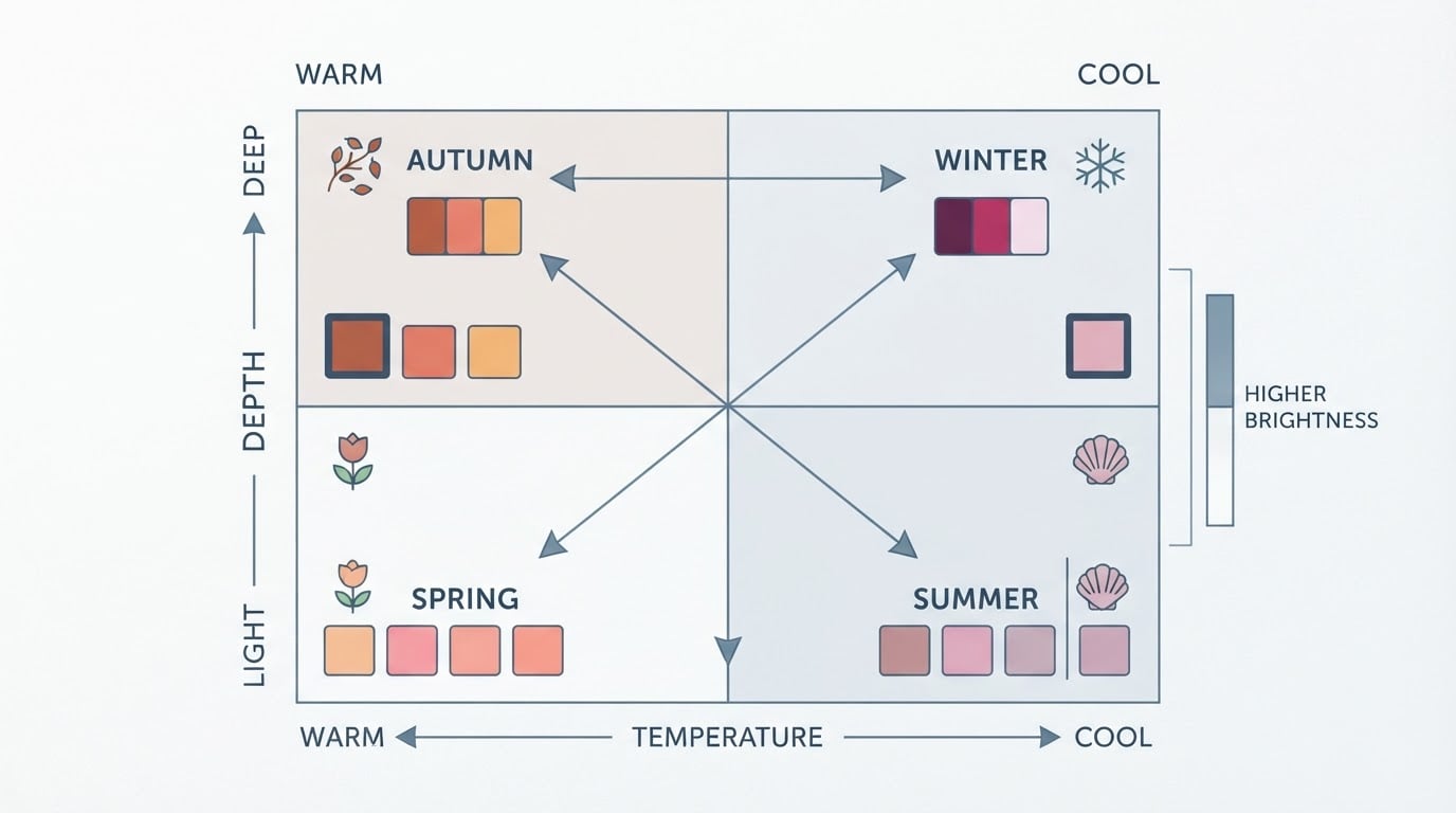
Light Summer is the lightest and softest of the cool seasons. The coloring sits at the light end of its range, leans blue rather than gold, and stays clear without turning loud. For a work wardrobe, that creates one consistent job: keep every piece light and cool, then add only as much contrast as the setting actually needs.
That is not the same as wearing any pastel. A pale but saturated garment, a color that is light yet warm, or a neutral that is darker and warmer than the palette will read as a separate object next to the outfit. Three questions keep the decision concrete:
- Is the color cool? Powder blue and lavender pass; peach, coral and golden mustard do not.
- Is it light? Paler tints of a cool hue belong; black and chocolate do not.
- Is it soft? A muted or dusty version works; fuchsia, electric blue and vivid violet are too loud.
Dress codes and personal preference decide how far you push each answer. The palette sets the color boundary; the workplace sets the contrast level.
Choose pastel blues and lavenders by temperature, depth and softness
Two garment families do most of the work, and each has a usable range rather than a single shade.
Blues: Powder Blue (#8AAEC2) is the anchor of the palette — cool, light and softly grayed. Light Blue Gray (#B8C9D9) and Soft Sky (#BBD9EC) sit paler and read almost like a cool neutral. Light Periwinkle (#9BB7D4) and Cool Blue Gray (#8FB8C8) add a little more body without becoming deep.
Lavenders: Soft Lavender (#C2A3CC) is the reference shade, dusty rather than sweet. Pale Lavender (#DBCAF0) and Pale Lilac (#D3BCE8) are the palest layers, and Soft Lilac (#C8B0D4) is the most present version for a statement piece.
Reading a shade in a shop is harder than it looks, because store lighting is warm and the label rarely tells you the temperature. The reliable method is comparison, not memory:
- Take two candidate garments to the same daylight spot.
- Compare one variable at a time: two blues, then two lavenders.
- Put the cooler option and the warmer option side by side. A warm sky blue will pull toward yellow next to powder blue; a warm pink-lilac will look golden next to a dusty lavender.
- Check the bright option too. If a blue or purple only works when it is saturated, it belongs outside this palette.
- Repeat the comparison before you buy, not after. Daylight near a window, no direct sun on the fabric, and no more than two garments in the frame.

A second comparison test works with the face instead of the wardrobe: try powder blue near your face, then a warm peach, and compare what you see. The point is the side-by-side difference, not a promise about how either will look.
Office neutrals that let the light colors do the talking
Light Summer neutrals are built from soft white, pearl, dove gray and rose gray rather than black and white. The neutral band includes Soft White (#E8E3DF), Cloud (#EDEAE7), Pearl (#D6D1CE), Mist (#DCD7D4), Dove Grey (#B5B0AD), Cool Stone (#BBB6B3), Rose Grey (#C8BFC4) and Mauve Grey (#CEC5CA).
Give the neutrals the large surfaces — trousers, skirts, blazers, coats, bags — and let pastel blue or lavender sit near the face. That division keeps the outfit professional without pushing the palette out of its depth range.
When you need something darker, reach for a cool mid-tone: soft navy, dove gray or a muted teal-blue. Black is the one to retire from a Light Summer work wardrobe; it is the heaviest color available and it flattens the light contrast the palette depends on. Warm browns and golden tans create the same problem from the other direction.
Pastel-blue work outfit formulas
Each formula has the same three roles: an anchor neutral for the largest area, a light cool main piece near the face, and one small accent.
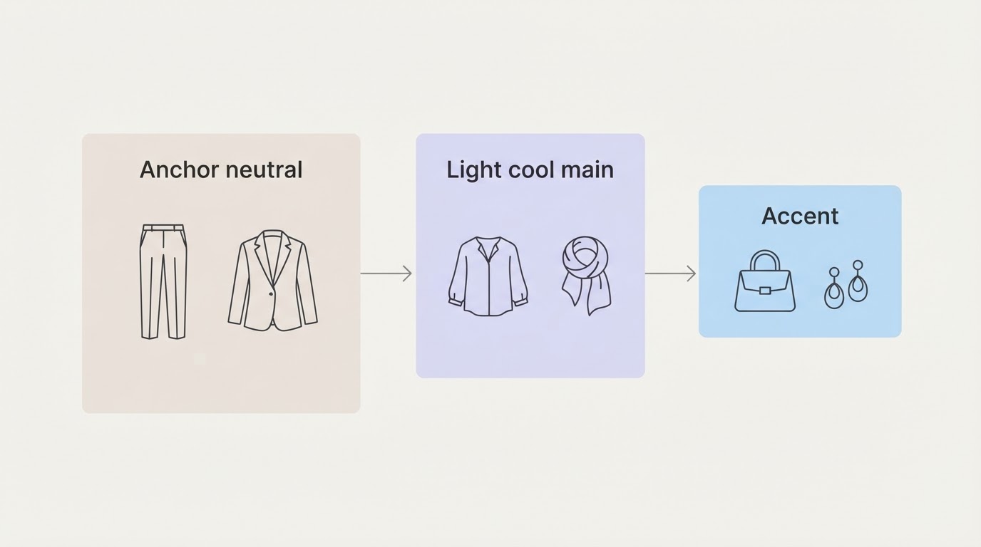
Business casual. Powder blue shirt (#8AAEC2) + dove gray trousers (#B5B0AD) + pearl or soft white bag (#D6D1CE) + silver or white gold jewelry.
Creative workplace. Light periwinkle knit (#9BB7D4) + cool blue-gray wide-leg trousers (#8FB8C8) + cloud jacket (#EDEAE7) + cool teal-blue accent shoes or scarf (#7BAAB5).
More formal. Cool blue-gray blazer (#8FB8C8) + soft white shirt (#E8E3DF) + dove gray trousers or skirt (#B5B0AD), with silver jewelry. A soft navy dress or trouser suit over a powder blue shell works the same way.
Menswear-leaning. Powder blue shirt + soft navy or dove gray suit + muted teal-blue tie, with a silver buckle or watch. Skip the black suit for this palette; if the dress code requires something dark, soft navy is the closer match.
Lavender and lilac work outfit formulas
Business casual. Pale lavender shirt (#DBCAF0) + pearl trousers (#D6D1CE) + rose gray blazer (#C8BFC4).
Creative workplace. Soft lilac top (#C8B0D4) + light blue-gray skirt (#B8C9D9) + pearl, moonstone or pale amethyst accessories.
More formal. Soft navy suit + pale lavender blouse, or a cool blue-gray blazer (#8FB8C8) over a soft lavender shell (#C2A3CC). Keep the jewelry cool and the print quiet.
Lavender is where warm temptations creep in: beige, tan, camel and black all fight the shade. Pair it with the palette neutrals instead, and keep the strongest lavender piece to one per outfit.
Wear blue and lavender together without losing definition
Blue and lavender sit close together on the color wheel, which is why they are easy to wear and easy to muddle. Five moves keep the outfit readable:
- Choose which color leads. One takes the larger area; the other becomes secondary.
- Separate them with a neutral layer — soft white, pearl or dove gray between the two colors.
- Vary depth. Put a paler tint against a midtone instead of two tints at the same depth.
- Vary texture. A matte crepe trouser with a fine knit, or a soft satin accent, gives the eye an edge that color alone cannot.
- Add one line. A belt, seam, shoe or bag edge in a cool neutral or accent finishes the silhouette.
Keep prints tonal and small-scale. A watercolor-style pattern in palette colors reads as one texture; a high-contrast graphic print splits the outfit into blocks.
The completion check is simple: you should be able to name which color leads and where the neutral separator sits. If you cannot, rebuild the outfit with a stronger depth step.
Adjust contrast for presentations, interviews and conservative dress codes
The palette does not change with the occasion; the amount of contrast does.
- Everyday low contrast. Light top, light bottom, one neutral layer. This is the palette at its most natural.
- Presentations. Drop the outer layer one step deeper — a soft navy or dove gray blazer — keep the light cool color near the face, and add a single accent such as Cool Blue Accent (#7A93AC) or Periwinkle Accent (#8FA5C4).
- Interviews. Lead with the neutral: dove gray or soft navy suit, pale blue or lavender shirt, silver or white gold jewelry, minimal pattern. The color is still Light Summer; the contrast simply reads more formal.
- Conservative dress codes. Swap pale-on-pale for a pale color over a deeper cool neutral. Keep hems, shoes and bags in the same neutral family, and keep jewelry finishes satin or brushed rather than mirror-polished.
Dress codes and personal preference vary by workplace, and none of these levels is a rule about what you must wear. Use them as a dial.
Adapt the formulas to your coloring, hair and personal style
Within one season there is still a range of coloring, and the formulas should flex with it.
Depth. If your hair and eyes sit at the deeper end of the Light Summer range, lead with the midtones and accents — Light Periwinkle, Soft Lilac, Cool Blue Accent — and use the palest tints as layers. If your contrast is very low, reverse the balance and keep the palest blues and lavenders closest to your face.
Neighboring seasons. Light Summer borders Light Spring and Cool Summer. If you sit between Light Summer and Cool Summer, borrow the medium-depth blues and lavenders shared by the two palettes. If you sit between Light Summer and Light Spring, stay on the cooler half of both.
Hair color. A new hair color changes the contrast in the frame, not the temperature of the palette. Re-check the formulas after a color change and adjust depth rather than abandoning the cool range.
Gender expression. The palette works in shirts, knits, skirts, suits, ties and outerwear. Choose the silhouette and formality that fit how you want to present; the color roles stay the same.
Accessibility. Comfort decides more than color. Soft, non-scratchy fabrics, easy closures, stable shoes and layers you can add or remove make a palette wearable. For pieces you wear and wash constantly, choose the midtones and neutrals rather than the palest tints. If a mobility aid, bag or device is part of the outfit, bring it into the same cool neutral family so the palette stays coherent.
Shoes, bags, jewelry and prints that connect the palette
Metals. Silver and white gold are the natural matches for a cool undertone, and rose gold also sits comfortably with the palette's pink cast. A satin or brushed finish suits the softness of the colors better than a mirror polish. Pearls, moonstone and pale amethyst repeat the palette in small doses; yellow gold and dark stones pull the other way.
Shoes and bags. Cool Stone (#BBB6B3), Dove Grey (#B5B0AD), Mist (#DCD7D4), soft navy and Cool Blue Accent (#7A93AC) cover most needs. Avoid warm tan, black and high-shine warm metallics.
Prints and patterns. Tonal, small-scale and watercolor-style prints keep the palette intact. Large geometric prints in black and white, or warm florals, fight it.
Scarves and layers. A pale lavender or powder blue scarf is the easiest way to test the palette near your face before committing to a larger garment.
Audit your work clothes before you buy anything
The fastest way to make this practical is an audit, and it costs nothing.
- Pull every work piece into one place in daylight.
- Sort it into three piles: light cool colors, cool neutral anchors, and everything else — warm, dark or bright.
- Build outfits from the first two piles only. Try the dress codes you actually dress for: business casual, creative, formal.
- Write down the gaps as roles, not moods: one neutral anchor, one light cool main, one accent.
- Set a target for each gap — a powder blue shirt, a dove gray trouser, a cool stone shoe — and note its nearest palette shade before you shop.
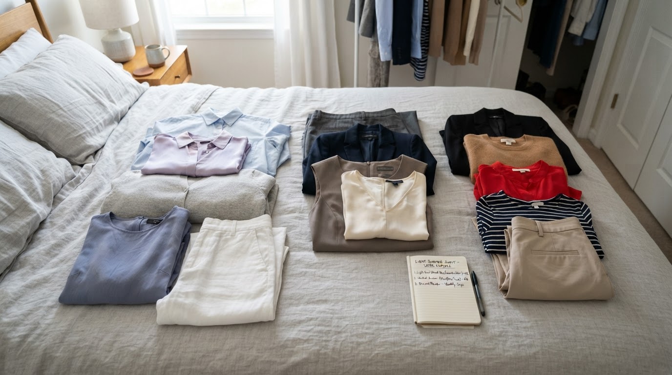
You are done with the audit when you can assemble at least three complete outfits for your main dress code from what you already own, and your shopping list contains only the gaps you could not fill. If the list is longer than the outfits you can build, cut it.
Photograph and compare in consistent light before buying more
One photo session stops most bad purchases.
- Choose a spot near a window with even daylight and no direct sun on the fabric.
- Use the same phone, the same angle and no filters. Keep makeup and hair the same across the session.
- Include a fixed reference in every frame — a soft white or pearl garment, or a neutral swatch.
- Shoot candidate garments side by side, two at a time, in the same light.
- Compare the photos across days, not from memory. The shirt that stays calm next to your neutrals and next to your face is the one to keep.
Store lighting is warm and stays warm from the fitting room to the till, so use your daylight photos as the reference. If a garment only looks right under the shop lights, leave it.
Where a palette check fits
If you are still deciding between Light Summer and a neighboring season, one extra reading can help before you rebuild a wardrobe. Tone & Fit's free photo analysis returns an estimated season with a confidence score and five starter colors, with no account required, and it runs in the browser from a single photo. The app is described as covering the full 38-shade Light Summer palette with hex codes, colors to avoid, makeup, hair and jewelry recommendations, and outfit formulas that turn palette colors into wearable combinations. Treat it as a second opinion: use it to confirm the direction, then let the audit and the daylight comparisons make the final call.
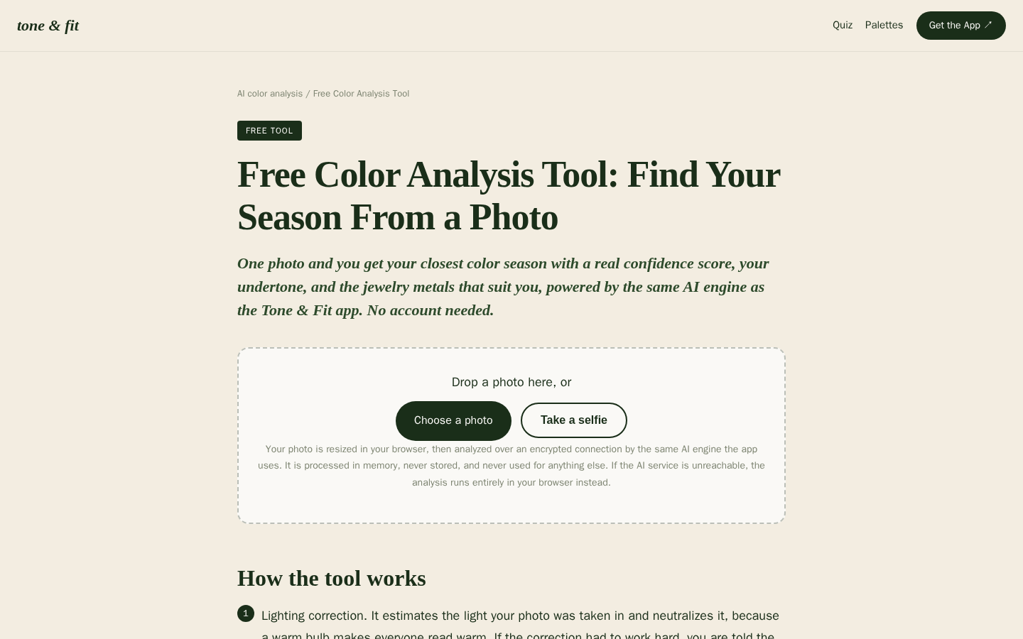
Desktop first-screen of the free web-based color analysis tool with photo upload drop zone, how-it-works steps, and privacy notes