Start With Your Actual Work Life, Not Your Swatch Fan
A palette tells you which colors relate to each other. It cannot tell you how many outfits you need, how warm your office is, or how you handle laundry. Those constraints decide which shades become workhorses and which stay occasional.
Write down four facts before you choose anything:
- Dress code. Ask what people at your level actually wear, not only what the handbook prints. Note the strictest day and the most casual day.
- Climate and indoor temperature. A humid summer commute and an over-air-conditioned office need different layers, even from the same palette.
- Laundry and care. If you wash at home or air-dry, shades that survive frequent washing and resist fading deserve the largest surfaces.
- Repetition tolerance. If you see the same colleagues five days a week, you need formulas that repeat without looking identical.
A workable standard: you can dress from this wardrobe in a few minutes on a normal morning, and you can get through a week without an emergency purchase. Every step below serves that standard rather than maximizing the number of shades you own.
Translate Your Result Into a Workwear Shortlist
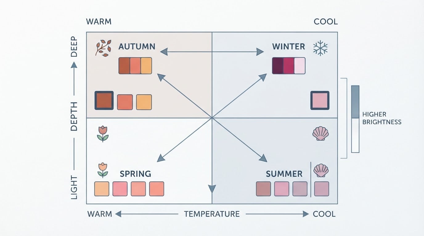
Personal color analysis is an industry method for matching clothing and cosmetic colors to a person's natural coloring, usually by placing that coloring in seasonal families such as Spring, Summer, Autumn, and Winter, with sub-variants. The classic framework rests on three dimensions: undertone (warm or cool), value (light to dark), and chroma (muted to bright), the same lightness and saturation axes that color science uses to describe any shade.
Approaches vary. Some systems use four seasons; others use twelve or sixteen; and different schools do not always agree on labels or boundaries. Read your result at the level it was given and use its own vocabulary instead of translating it into another system's season name. Your result also tells you which shades to keep away from your face, which matters more at work than anywhere else, because workwear tends to repeat.
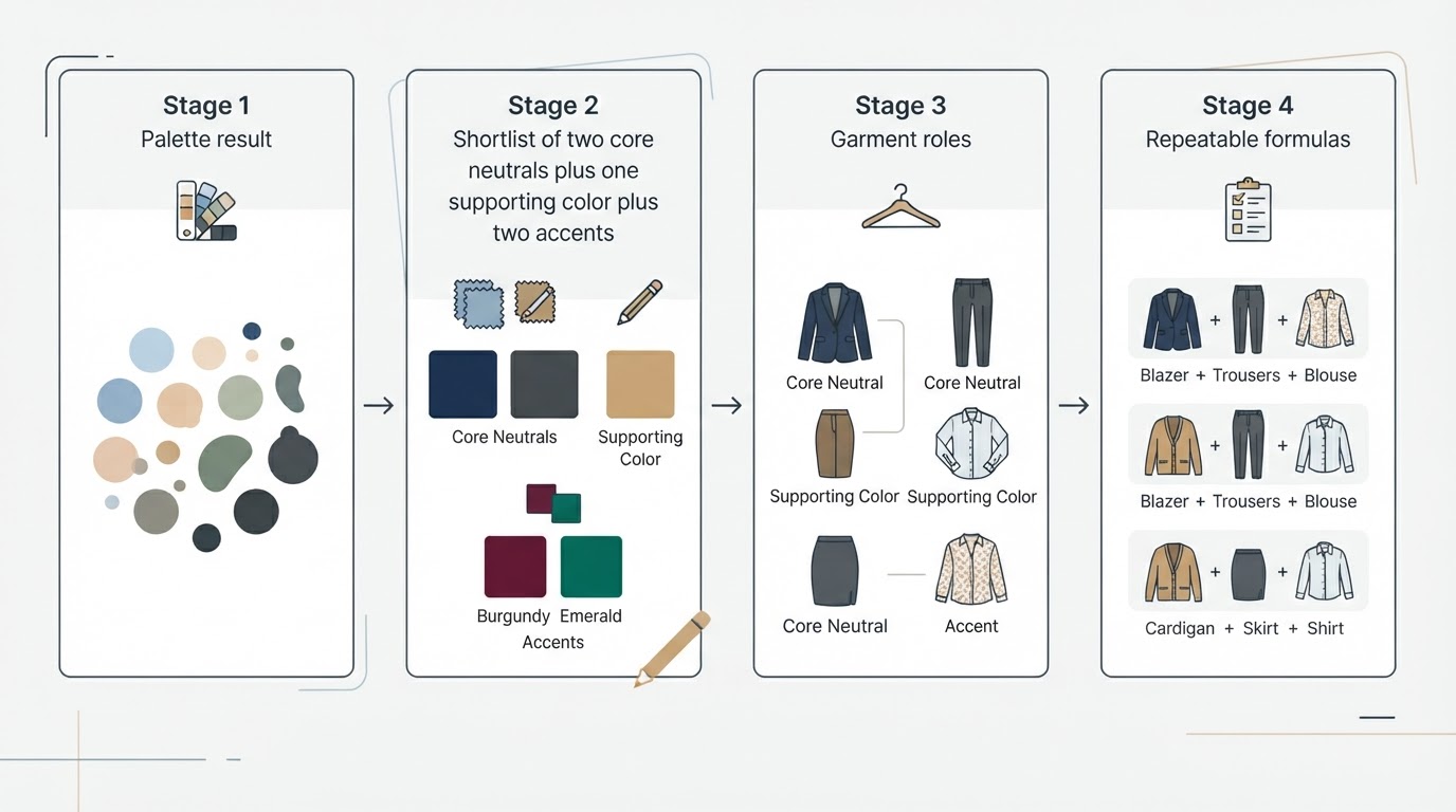
Turn the result into a shortlist with four buckets:
- Core neutrals. The shades that can cover large areas: trousers, skirts, jackets, coats.
- Supporting colors. The shades that can carry a whole outfit or a prominent layer.
- Accents. The shades you want in small doses.
- Not for me. Shades you dislike or cannot see yourself maintaining. Leave them out.
For most people that produces six to eight shades plus a jewelry metal. If your result gave you twenty shades, the shortlist is the filter that makes it usable.
Choose Two Core Neutrals That Coordinate With Clothes You Already Own
Core neutrals form the base of every formula: trousers, skirts, blazers, and outerwear. Because they cover the largest surfaces, they need to survive repetition and cooperate with what you already own.
Test a candidate neutral three ways before you commit:
- Lay it next to three garments you already wear to work. If it fights two of them, it is not a core neutral; it is a supporting color.
- Check it in the light where you actually get dressed. A shade that reads charcoal indoors can look green in direct morning light. You need to like both readings, not just the store's lighting.
- Confirm the neutral comes in the fabric weights you need across the year. A light version for warm months and a heavier version for cold months make layering easier.
If you already own one strong neutral, keep it and add a second that creates contrast: light with dark, or warm with cool inside your palette. Two neutrals that sit at the same depth and temperature make every outfit feel flat, no matter how well each shade suits you alone.
Add One Supporting Color and, Optionally, Two Accents
Your supporting color is the non-neutral that appears often enough to read as part of your signature: a knit, a shirt, a dress, a coat lining. Choose it from the shades your result already marks as flattering, then check that it works with both core neutrals. If it works with only one, you will wear it rarely.
Accents are the smallest surfaces: a scarf, a belt, a bag, shoes, jewelry. Treat two as the ceiling. Three or more accent colors turn a coordinated outfit into a series of separate decisions. If you are starting out, pick one accent that echoes the supporting color and one that adds depth or brightness.
Assign Colors to Garment Roles
Large surfaces get your neutrals, near-face surfaces get your most flattering shades, and small surfaces get accents. That sentence is the whole method; the table below makes it concrete.
Garment role | Job in the outfit | Best color treatment |
|---|---|---|
Jacket, blazer, coat | Sets structure and the first impression | A core neutral; a supporting color as a second jacket |
Trousers, skirt | Carries the base of every formula | A core neutral |
Dress | Can be an entire outfit | A supporting color, or a neutral in a textured fabric |
Shirt, blouse, top | Sits closest to your face | A supporting color, a softer neutral, or a muted print |
Knitwear, third layer | Adds warmth and changes one slot of a formula | A supporting color; an accent on cold days |
Shoes, bag, belt | Repeats across many outfits | An accent, or a second neutral if you dislike matching |
Two cautions. A color that works in a scarf may overwhelm you as a full jacket, so test each shade at the size you intend to wear. And if your workplace runs on dark tailoring, use the near-face slot, the shirt or scarf, for the palette shades you most want to see.
Build Two-Piece and Three-Piece Formulas
A two-piece formula is a base plus a top. A three-piece formula adds a third layer. Four or five working formulas are enough for a full week, and once you have them, getting dressed becomes arithmetic rather than taste.
Formula | Base | Top | Third layer | Works best for |
|---|---|---|---|---|
Neutral on neutral | Core neutral trouser or skirt | Core neutral shirt or knit | Same-tone jacket, or none | Formal offices and meeting days |
Contrast sandwich | Core neutral base | Supporting color top | Core neutral third layer | Everyday business casual |
Dress plus layer | Supporting or neutral dress | None needed | Neutral blazer or cardigan | Commutes and temperature swings |
Accent small | Core neutral base | Core neutral top | Accent scarf or knit | Repeating a formula without repeating the look |
Print anchor | Print piece containing a neutral and a palette color | Solid top or base | The core neutral in the print | Creative workplaces |
Keep each formula to two or three colors, counting the neutral base as one. When you swap the top and keep the base and third layer, you get a new outfit without a new decision.
Adapt the Same Formulas to Your Dress Code
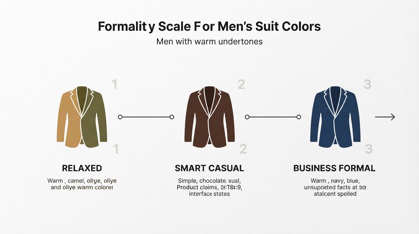
Business formal asks for the most conservative version of your palette: a matching or near-matching suit, a shirt that reads as a neutral or a soft supporting color, and restrained accessories. In practice, business casual is intentionally fuzzy. It is described as an ambiguously defined dress code in which a dress shirt and trousers replace a full suit, ties are optional, and a blazer or sport coat may be worn or left off. That flexibility helps: business casual is where your supporting color and one accent can do the most work.
Creative workplaces allow more accent surface, more texture, and a looser fit, but the roles stay the same. Whatever the label says, verify it against your own workplace, because dress codes vary by region and even between teams in the same building.
Use Prints and Textures Without Making the Wardrobe Difficult to Coordinate
A print is useful only when it contains at least one core neutral and one color from your palette. Then every patterned piece has a partner waiting in your wardrobe, and you never need to invent a third color to make it work.
Limit each outfit to one print. Use texture, not pattern, for variation inside a single color: a ribbed knit, a twill trouser, a matte blouse next to a satin skirt. Texture changes how light reads on the same shade, so tone-on-tone outfits stay interesting without adding colors you have to remember.
Plan Shoes, Bags, Belts, and Jewelry Around Multiple Outfits
Accessories are where a small palette becomes flexible. Start with the metal that suits your undertone: warm undertones generally harmonize with gold tones, cool undertones with silver or platinum tones, and neutral undertones can often wear either. If your analysis already names a metal, repeat it in your watch, earrings, buckle, and hardware so the outfit reads as intentional.
Then pick accessories by how many formulas they serve. Two pairs of shoes, one to two bags, and one or two belts that each work with every formula will beat a larger, more specific collection. The test: choose any three outfits from your formulas and confirm that the same shoes, bag, and belt work with all three.
Audit Your Wardrobe Before You Build a Shopping List
Take everything you wear to work and sort it into four piles: keep, repair or alter, retire, and undecided. Rebuild your formulas using only the keep pile, then notice which slots stay empty. The empty slots are your list; the undecided pile is what you reassess after the sample week.

The capsule wardrobe tradition is about interchangeability rather than a fixed number of items. The term was revived by the London boutique owner Susie Faux in the 1970s, and the designer Donna Karan popularized the idea in 1985 with an interchangeable workwear collection. Borrow the principle of pieces that cooperate; ignore any item count that does not fit your life. This is not a capsule wardrobe guide, and you are not required to shrink your closet.
Prioritize High-Use Gaps Instead of Replacing Off-Palette Clothing
Rank each gap by the number of outfits it unlocks, not by how perfectly it matches your palette. A missing third layer in a core neutral can complete four formulas; a beautiful accent piece that works with one outfit may be the worse buy.
Off-palette clothes do not have to be banished. Keep them away from your face, balance them with a palette scarf or layer, or reserve them for days when you are not client-facing. A wardrobe that works on Monday morning matters more than a palette purity test.
Test the Plan With a Sample Workweek
On a Sunday, assemble five weekday outfits from your formulas and the clothes you already own. Hang them in order or photograph them. Then wear the plan for one week and note two things each day: how long the outfit took to choose, and whether you felt comfortable wearing it for the full day.
The week is complete when all five of these are true:
- Five weekday outfits are planned and worn, one per day.
- At least three outfits use a third layer.
- Every core piece in the plan is worn at least once.
- No morning takes more than a couple of minutes to dress.
- No purchase is required to finish the week.
If a formula fails, change one slot, a top or a layer or a pair of shoes, instead of rewriting the plan. If the same slot fails repeatedly, you have found a real shopping gap.
Adjust for Uniforms, Cultural Dress, Accessibility Needs, and Personal Preference
Not every work wardrobe can follow the same script.
- Uniforms. Treat the uniform as fixed and apply your palette to what you control: layers, scarves, socks, jewelry, bags, and grooming.
- Cultural dress. Treat traditional garments as anchors and use color roles for the pieces around them, so the palette supports how you already dress instead of replacing it.
- Accessibility needs. Prioritize fastenings, fabric weight, comfort, and laundry practicality. Color is one input in the decision, never the whole decision.
- Personal preference. If you dislike a shade in your result, leave it out. A palette you do not enjoy will not survive a workweek, and no analysis is more authoritative than your own willingness to wear the clothes.
Where Tone & Fit Fits In
If your palette currently lives in a screenshot you can no longer find, or you have never had your coloring analyzed, Tone & Fit offers one way to get a structured starting point. It analyzes a photo to produce a color result and pairs that result with outfit formulas for turning palette colors into wearable combinations; the guidance also covers menswear pieces such as suits, shirts, and outerwear. Use it the way you would use any analysis result: translate it into two core neutrals, one supporting color, and the garment roles above, then run the sample week before you buy anything.
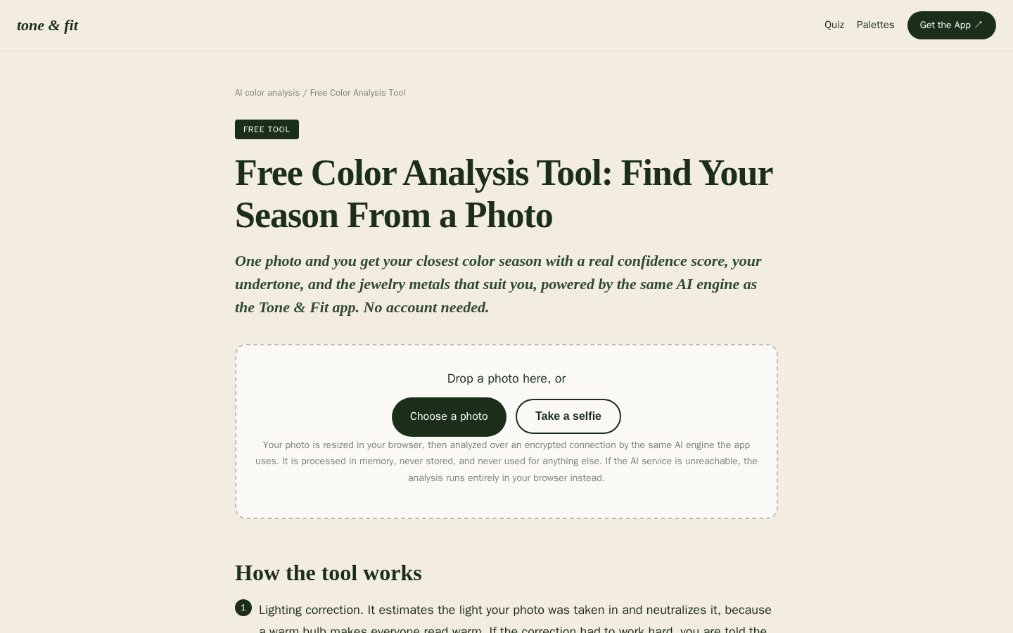
Desktop first-screen of the free web-based color analysis tool with photo upload drop zone, how-it-works steps, and privacy notes
Run your photo through Tone & Fit's color analysis, then bring the result back to the two-neutral exercise and test one formula this week.