What a Cool-Undertone Result Can—and Cannot—Tell You About Outfits
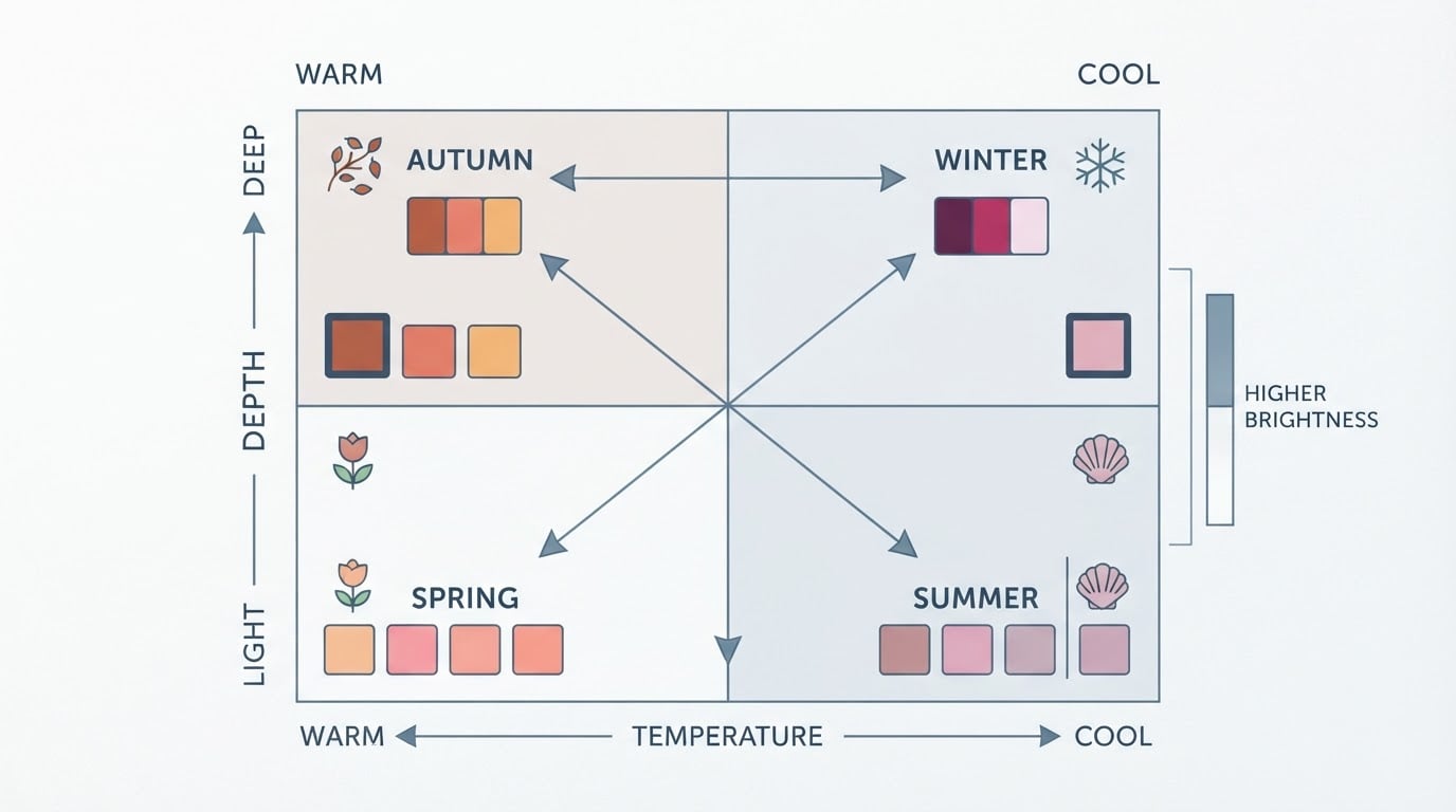
A cool-undertone result answers one question well: the temperature your coloring leans toward. In seasonal color analysis, temperature is only one of three measured properties. Undertone covers warm, cool or neutral; value covers how light or deep your coloring is; and chroma covers how bright or muted it is. Many stylists treat contrast — the gap between your hair, skin and eyes — as a practical fourth dimension, because high-contrast coloring and low-contrast coloring suit different outfit combinations even when both are cool (Wearly Labs).
What the result cannot do is name a single best shade, decide your style, or guarantee an outcome. Undertone also has nothing to do with how light or dark your skin is: people at every depth can be cool, warm or neutral, and a significant group sits in the middle as neutral (Palette Hunt). Treat your result as a starting filter rather than a rulebook. The formulas below turn it into outfits you can repeat without rethinking every morning.
Choose Two or Three Cool-Leaning Neutrals You Already Own
Look at your wardrobe before buying anything. Cool-leaning neutrals include slate and cool grey, navy, charcoal, ink and blue-black denim, soft white, and taupe with a grey base. Pick the two or three you already wear most, because those pieces will act as the base of almost every formula. Hold them next to your face in daylight and keep the ones that make your skin look even. If a "neutral" makes you look grey or tired, it is probably too warm or too yellow to be your base layer.
This step alone gives you a working cool undertone color palette: a small set of bases you trust, plus everything else as accents.
Everyday Two-Color Formulas: Neutral Base Plus One Accent
The simplest repeatable combination is a neutral base with a single accent, at roughly 70/30. The base covers most of the outfit; the accent carries the color. A few cool undertone casual outfit ideas to copy:
- Navy trousers with a raspberry knit
- Slate trousers or a slate skirt with an icy blue shirt
- Charcoal coat over a cobalt scarf
- Blue-black jeans with a soft white tee and a mauve bag
Each of these stays casual, and each can be sharpened for smart casual by swapping the knit for a fine-gauge sweater or the jeans for tailored trousers. Notice that the accent is one item, not one category. A berry knit plus a berry bag is a two-color outfit with a repeated accent, not a three-color formula.
Three-Color Formulas: Base, Supporting Colour and Small Accent
When you want more depth, add a supporting color and keep the accent small. The proportions matter more than the exact shades:
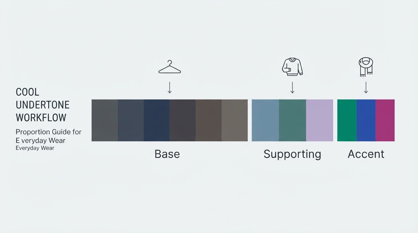
Role | Share | What it does | Example |
|---|---|---|---|
Base | About 60% | Sets the temperature and anchors the outfit | Navy trousers |
Supporting | About 30% | Bridges the base and the accent | Soft blue shirt |
Accent | About 10% | Draws the eye without dominating | Berry belt or cool red scarf |
Built out, that is navy trousers, a soft blue shirt, a berry belt and silver-toned jewelry. A smart-casual version might use a charcoal blazer as the base, a grey knit as the supporting layer, and cobalt loafers as the accent. If the outfit starts to feel busy, cut the accent rather than the base; the base is what makes the combination read as cool-toned.
Low-Contrast Combinations Using Softened Blues, Mauves, Cool Greens and Greys
Low-contrast formulas keep the shades close in value, so the outfit reads as one calm block of color. They suit readers whose hair, skin and eyes sit near each other in lightness, and they are easy to wear in quiet workplaces. Try:
- A softened blue shirt with mid-grey trousers
- A mauve knit with a grey skirt or trousers
- A cool green top with slate denim
- A dusty rose blouse with charcoal
Keep the gap between shades to one or two steps on the light-to-dark scale. If the outfit looks flat rather than calm, add a small accent — a deeper bag or a metallic piece — instead of swapping the base.
Higher-Contrast Combinations Using Navy, White, Berry, Cobalt or Cool Red
Higher-contrast formulas use a clear light-versus-dark gap and work well if your own coloring already has one. Start with the light-dark pairing, then add one saturated cool color:
- A white shirt with navy trousers
- A soft white knit with ink or charcoal
- A berry top with a navy or charcoal base
- A cobalt accent on a white-and-navy outfit
- A cool red — one with a blue base rather than an orange one — as the single accent
Keep the saturated color to 10–20% of the visible outfit. If black and pure white feel too sharp against your face, ink and soft white deliver a similar contrast with less harshness.
How to Use Denim, Black and White Without Treating Them as Mandatory
Denim usually has a blue base, which makes it a natural fit for cool-leaning combinations, especially in indigo and blue-black washes. Black and white are strong contrast tools, not obligations. Pure black can look heavy near the face for lighter, softer coloring, so charcoal, ink or blue-black often do the same job with less weight. Pure white can look harsh on some readers; soft white or cool off-white keeps the outfit bright without the glare. Decide per outfit: if you want a high-contrast look, reach for black or white; if you want a softer look, reach for ink and soft white. None of the three needs to be the backbone of your wardrobe.
Adding Prints, Shoes, Bags and Jewelry to a Cool-Leaning Combination
Prints are easiest when the pattern already contains colors you are wearing. Choose one print piece and pull one of its colors into a solid supporting layer; that keeps the print from arriving as a separate outfit. For shoes and bags, repeat a color that is already in the outfit or stay in cool neutrals such as grey, navy and taupe, so the accent remains a single deliberate item. Jewelry is the quickest way to shift an outfit cooler: silver, white gold, platinum and pewter tones generally sit closer to a cool palette, while gold reads warmer. If you prefer gold, keep it small and let the rest of the outfit stay cool. You are choosing a temperature, not banning a metal.
Adjusting Each Formula for Colour Depth and Intensity
The same two-color and three-color formulas flex with your value and chroma:
- Light coloring: keep bases light — soft white, dove grey, light navy — and keep the accent soft, so the dark piece does not take over the outfit.
- Deep coloring: richer bases such as ink, charcoal and true navy carry well; choose medium-to-deep accents such as berry or cobalt rather than pale pastels, which can look disconnected.
- Muted coloring: choose the dusty version of every color and skip anything neon or highly saturated, even if it is technically cool.
- Bright coloring: you can carry vivid accents — fuchsia, cobalt, cool emerald — and may find dusty shades go flat against your face.
Combined examples: light and muted points to a soft blue shirt with dove grey trousers; deep and bright points to a true navy base with a cobalt accent; light and bright can take a soft white base with a raspberry accent.
A One-Week Outfit-Planning Exercise Using Clothes You Already Own
Set aside thirty minutes and work through these steps:
- Pull three neutrals, two accents — one soft, one strong — and one print that contains at least one of each.
- Build five outfits, one for each weekday, using either the two-color or three-color formula. Note the base, supporting piece and accent for each.
- Try each outfit on in daylight for two minutes and check that the contrast level matches your own coloring rather than fighting it.
- Photograph each outfit in the same light, then mark the one you felt best in and write one line about why — the base color, the accent size, or the contrast level.
Your completion standard: five outfits made only from pieces you already own, one written note per outfit, and at least one formula you would happily repeat next week. If a formula fails, change the accent first. The base is doing the structural work.
How to Compare Borderline Warm and Cool Shades in Consistent Lighting
Lighting changes color more than most people expect. Warm bulbs make everyone look warmer, cool office lights make everyone look paler, and a phone camera then adjusts white balance and changes the color again — which is how the same person can be typed differently across photos (Wearly Labs). To compare two borderline shades, use one consistent setting: natural daylight near a window, mid-morning, no makeup and no filter, with the same background behind both. Hold the two garments side by side and photograph them in a single frame so the camera processes them under identical conditions. Where the difference is still unclear, choose the shade that makes your skin look even along the jawline.

If an at-home test gives mixed results, that is useful information rather than a failure. The vein test is most reliable on lighter to medium skin and becomes harder to read on deeper skin, and the sun-reaction test is influenced by melanin levels, so it works best as a supporting signal (Aurotype). When several tests disagree, assume neutral or lean toward muted, balanced versions of the color.
When to Prioritise Preference, Uniform Requirements or Dress Code Over Palette Guidance
A palette is one input among several. Uniform rules, workplace dress codes, safety requirements, budget, comfort, climate and personal preference all outrank it. Inside those constraints, use the structure rather than the shades: choose the coolest neutral available to you, set the contrast level you find comfortable, and add the accent in a fabric you enjoy wearing. A cool-undertone result is a tool for narrowing choices, not a restriction on what you are allowed to like.
Put the Formulas to Work
If you already have a cool-undertone result, run one two-color formula this week and see how quickly getting dressed becomes. If you do not yet have a result, run a free Tone & Fit color analysis or download the app, then come back to the same three steps: choose your neutrals, set a contrast level, and add one accent.